
What a whirlwind of a year 2010 has been… in world events, in life and in work. And what better way to reflect on the year than to utilize the largest search engine Google to see a snapshot of the biggest events and searched terms of the year both globally and by country.
Google recently released Zeitgeist 2010: How the world searched. Here, you can find animated graphing using HTML5 (the latest and greatest in coding), which shows an aggregation of the terms that people all around the globe searched throughout 2010. Take a second to look at the search stars that have fallen and risen over the past year.
One of my favorite parts of this press release is the 2010 in Review video below. It shows a great recap some of the year’s biggest struggles, achievements, tragedies and milestones.
From myself and Sentient Services, we hope everyone has a wonderful holiday season. We cannot wait to see what 2011 will bring. Enjoy!
Friday, December 10, 2010
Friday, November 12, 2010
Does marketing really work?
One big question on every business owner’s mind: “Is the money I am spending on marketing and or advertising really working?” As part of my job, I spend lots of time trying to help optimize the marketing and advertising for companies. The problem is that it is not always easy to track and quantify with numbers if all their work and money is truly paying off in the end. Today I came across this quick survey that I found very interesting by CramerSweeney - http://www.cramersweeney.com/smiq.html. It tests the recognition of brands using 4 main areas:
1. Icon Identification
2. Tagline Memorization
3. Mascot Identification
4. Audible Recognition
While most of the brands used here are fairly mainstream brands, I think many people would be surprised at the amount of marketing and advertising they actually absorb unconsciously. I identified 17 out of the 20 brands, some of which I actually use and some of which I have never used but unconsciously knew the tagline or mascot.
So my point is this, while it is not always easy to quantify how well marketing works and allot a number of customers to the dollars you are spending, marketing and the messages you send to customers get absorbed in many ways (and that list is ever expanding with social media). This has implications for how ROI is calculated and how “standard” market research to develop and measure marketing effectiveness is done. Sentient is currently exploring new ways to do this. Let us know if you have any great ideas to share.
Last, but not least, we think the actual survey format and tool CramerSweeney uses is pretty cool, interactive and engaging. Let us know your thoughts on any other survey tools you find interesting.
Friday, October 29, 2010
Marketing 101
Believe in what you are doing, build great stuff and sell the hell out of it.
That is what Apple does. For a quick and funny snap shot of their recent release of the new MacBook Air check out the video below. And then read the quick summary on TechCrunch.
In today's market - product is marketing, marketing is product. When you realize that and break down silos between product development, design, research and marketing you get a team working seamlessly together with a shared vision and focused goal. The result is the video below.
Friday, October 22, 2010
Velvet Rope Clients
Admittedly this is a weak blog post - I am posting about another blog, that was posting about a book. However; it has been a very busy few weeks and the other post is really good and gets to a core tenet here at Sentient Services - we do great work, for great people and great companies. Life is too short to work on junk and with not-so-nice people.
We are very fond of saying "We don't have clients, we have friends that happen to pay us money.". And, that is very true. Our "clients" are great friends - we travel the world together (drink tea in Turkey, hike to through the alleys in Hong Kong, beer in Germany), work long hours, create game changing products, and have a lot of fun along the way...good friends + good clients = great times!
Read about what makes great clients and some guidelines on the GetSatisfaction blog. It covers Michael Port's books and philosophy.
The key takeaway:
Enjoy and have a great weekend!
We are very fond of saying "We don't have clients, we have friends that happen to pay us money.". And, that is very true. Our "clients" are great friends - we travel the world together (drink tea in Turkey, hike to through the alleys in Hong Kong, beer in Germany), work long hours, create game changing products, and have a lot of fun along the way...good friends + good clients = great times!
Read about what makes great clients and some guidelines on the GetSatisfaction blog. It covers Michael Port's books and philosophy.
The key takeaway:
Do you have your own red velvet rope policy that allows in only the most ideal clients, the ones who energize and inspire you? If you don’t, you will shortly. Why?
First, because when you work with clients you love, you’ll truly enjoy the work you’re doing; you’ll love every minute of it. And when you love every minute of the work you do, you’ll do your best work, which is essential to book yourself solid.
Enjoy and have a great weekend!
Saturday, October 9, 2010
Research 101
A friend just shared this Penn & Teller video with me. WARNING - NOT SAFE TO PLAY ON THE LOUD SPEAKERS AT WORK. While not completely academically correct, or a thorough two-sided investigation (not that there are ever many of those), it does quickly and easily explain some basics of survey writing, analysis and how it can all go wrong. And, it is entertaining. Some very basic things to watch when writing a survey:
Okay, here is the darn video - enjoy!
- Non-response bias. Who does not answer can sometimes be more compelling than who does. Quick example: Do a phone survey Monday night on TV matching habits. The results? Hardly anyone watches football anymore! No, not really - the people watching football did not answer the phone. You have a big non-response problem. That is why, for all surveys you want to manage replicates (how much sample you release), contact design (how many times and over how many days you try to reach a record before you call it dead) and always take into account non-response bias.
- Scales: Likert scales (good Wikipedia overview here) are the standard. But, even how you use these varies widely. A few quick comments:
- Using 4-point, 5-point, 7-point, 10-point scales. Always a hot debate here, quite enthralling and very sexy. But, in a nutshell I favor 5-point for several reasons. When you use 10-point, you typically roll up "top-box" as 9+10, so why not just go with 5 and make it easier? 10-point causes more respondent fatigue - larger survey questions (actually twice as long), more options, etc. Additionally, what is the difference between and 8 and 9? Moving from 4 to 5 seems a lot clearer form an analysis standpoint and form a respondent standpoint.
- End-labeled or label all points? If you can, always label all points. The human mind is much better and more consistent at deciding between "somewhat satisfied" and "very satisfied" more so than "3" vs. "4". This is another argument to keep scales short - you can't anchor every point on a 10-point scale, but you can on a 5-point scale.
- Neutral point? Typically I say no. The idea of using a scale is to differentiate respondents; to differentiate the most satisfied or dissatisfied - to find those levers you can pull as a business to make a difference. Allowing a neutral typically wastes a scale point. Instead I prefer to do a positively weighted 5-point scale (e.g., not at all satisfied, not very satisfied, satisfied, very satisfied, extremely satisfied). We want to make that "top box" the cream of the crop; hard for people to check, but if someone checks it you know you want to figure out how to get more of them. The goal is to move your 3s and 4s to this 5 spot. And, to figure out how to limit the bleeding with your 1s and 2s.
- Don't Know: The inclusion of "Don't Know" as an answer choice can drastically skew survey results. The classic example is in voter polls. If you only give the option of the two candidates with now "undecided" option your survey results can be drastically different than if you allow for an "undecided" option. Last minute voter turn-out drives, the results of primary races, the overall propensity for "undecided" voters to lean towards a given party - all throw off results by the inclusion or exclusion of this one "little" answer choice.
Okay, here is the darn video - enjoy!
Friday, September 17, 2010
Design Thinking Applied To New iPad App
I came across this good, quick read on design thinking and applying it to launching a new business - in this case the iPad app Pulse from Alphonso Labs. You can read it here. In a nutshell here are the 5 steps:
1)Empathize: Research and understand the end-user - their needs, pains and usage scenarios.
2)Define: Focus on a core niche and then research that niche to define the why and how.
3)Ideate: Brainstorm sessions and innovation.
4)Create Prototype: These can be rough and even Post-It notes. But create something to narrow and code from.
5)Test: Usability test in the real world.
I would add a 6th one here which is to get Steve Jobs to present your app at the launch of iPad...which happened for Pulse. The result of good design or luck? Probably both, but you won't get lucky with bad design!
Monday, August 30, 2010
Lessons from Hawaii
At the end of June through the beginning of July, I took advantage of Sentient’s sabbatical benefit and took off to Hawaii for two weeks in the great outdoors. Unplugging for a full two weeks was a little bit of a challenge – I went through email withdrawal for the first couple of days. Once I did unplug, I was able to regain some perspective outside of my computer and smartphone.
Lesson #1: You have to get dirty to find the best views.
On Maui, we drove the road to Hana and saw LOTS of waterfalls. By far the most fun we had at one was in Pua’a Ka’a State Park. However NOT at the lower falls that you just stroll to on the park’s walkway; instead, the upper falls aboe that one.
Our guidebook, Maui Revealed by Andrew Doughty (which we highly recommend), clued us in:

There were at least 3 different times where I wanted to turn back – crossing the viaduct was one of them.

But being the only person swimming in the waterfall’s pool was definitely worth all the work.

Takeaway: Don’t be content with the status quo – find new trails in your work. From a research perspective, this could mean:
We also visited Mount Haleakala, the dormant volcano on Maui. Going up the 10,023 feet, I saw terrain and vegetation that reminded me of the alpine climate I have seen in the Colorado Rocky Mountain National Park. However, there were some plants, like the silversword, that I had never seen before. We were also lucky enough to see one that was blooming – something that they only do once in their lifespan of 50 years before dying.

And then there was the crater. This was terrain that I had never seen before, yet my brain still tried to relate it to something – namely what I imagine the terrain of Mars to look like.

Takeaway: When presenting something new, make it relevant. For example, relate new research findings to things that your audience might be familiar with – previous research, industry news, etc.
Lesson #3: You’re more interesting when you’re moving.
Starting to wonder if I spent any time in the ocean? Well yes, we went on a snorkel trip to Molokini. We saw all sorts of coral and fish.


On the way back to Maui, some dolphins started swimming around our boat. The captain stopped and the dolphins came to check us out. They played a bit, and then started swimming away. When the boat started moving again, the dolphins were immediately back, in front of the bow, and racing the boat – we were much more interesting when we were moving.

Takeaway: MOVE on your findings. At Sentient, we are always customizing and finding creative and actionable ways to interpret and present research that allows our clients to:
Lesson #1: You have to get dirty to find the best views.
On Maui, we drove the road to Hana and saw LOTS of waterfalls. By far the most fun we had at one was in Pua’a Ka’a State Park. However NOT at the lower falls that you just stroll to on the park’s walkway; instead, the upper falls aboe that one.
 |
| Lower Falls |
 |
| Upper Falls |
“There’s an awkward trail on the right of the upper falls. It first leads to a short path to the top of the falls, but if you go past it for 5-10 squishy minutes (it’s usually muddy), there’s a much heavier untapped falls and pool just above the diversion ditch that’s taking much of the lower falls’ water. When the trail gets to the elevated waterway (viaduct), you have to walk along it (which those afraid of heights will hate), then across. Only 100 more feet upstream is your prize.”Awkward, squishy and muddy are all understatements – the whole trail was practically a slip-n-slide. At one point my hiking shoes were completely submerged in mud. These were new shoes when I left for Hawaii, and after this hike, they looked like this.

There were at least 3 different times where I wanted to turn back – crossing the viaduct was one of them.

But being the only person swimming in the waterfall’s pool was definitely worth all the work.

Takeaway: Don’t be content with the status quo – find new trails in your work. From a research perspective, this could mean:
- Using a new technique to understand the desirability of a design described in the paper Measuring Desirability: New Methods for Evaluating Desirability in a Usability Lab Setting (WORD DOC) by Joey Benedeck and Trish Miner of Microsoft
- Trying a new platform from 20|20 Research with a mobile population that lets you reach respondents via text message
- Reading this month’s edition of Quirks to learn more about social media research (PDF)
We also visited Mount Haleakala, the dormant volcano on Maui. Going up the 10,023 feet, I saw terrain and vegetation that reminded me of the alpine climate I have seen in the Colorado Rocky Mountain National Park. However, there were some plants, like the silversword, that I had never seen before. We were also lucky enough to see one that was blooming – something that they only do once in their lifespan of 50 years before dying.

And then there was the crater. This was terrain that I had never seen before, yet my brain still tried to relate it to something – namely what I imagine the terrain of Mars to look like.

Takeaway: When presenting something new, make it relevant. For example, relate new research findings to things that your audience might be familiar with – previous research, industry news, etc.
Lesson #3: You’re more interesting when you’re moving.
Starting to wonder if I spent any time in the ocean? Well yes, we went on a snorkel trip to Molokini. We saw all sorts of coral and fish.


On the way back to Maui, some dolphins started swimming around our boat. The captain stopped and the dolphins came to check us out. They played a bit, and then started swimming away. When the boat started moving again, the dolphins were immediately back, in front of the bow, and racing the boat – we were much more interesting when we were moving.

Takeaway: MOVE on your findings. At Sentient, we are always customizing and finding creative and actionable ways to interpret and present research that allows our clients to:
- Know the why behind the what
- Easily distribute market intelligence throughout the organization
- Take action and build consensus based upon market research
- Have complete confidence in the analytics and validity of implications
Friday, August 13, 2010
Ideas On Usability Presentations
So, this could be considered a lazy blog post - a blog post about another blog post. And, this other blog post is about other posts and presentations on usability, so this could be considered extremely lazy on my part.
However, click here for the Useful Usability blog and get links to 5 Radical Ideas From Usability Presentations. There is stuff in here for UX professionals, iPhone developers and tips on presenting research findings. All good stuff.Share it this post around and let us know what radical ideas you have for presenting usability research.
Here is a quick link to the first presentation covered:
Wednesday, July 14, 2010
The Power of Mobile Market Research
As advertising to the public via mobile phones becomes more widespread, it will be interesting to see what the future holds for other marketing activities – including market research. Market research will need to keep pace with location-based marketing services like FourSquare, wantANDfound, Gowalla, Loopt, Whrrl, Placecast and many others. Emerging as the latest medium for reaching consumers, how can mobile research technologies be utilized to gain deeper and richer insights into behavior and drive innovation? Think about it, what if customers could give feedback anytime, anywhere to improve products and services – right when the issue happens or the idea arises!
A relatively new tool we have come across is QualAnywhere from 20/20 Research, Inc. QualAnywhere allows you to build panels or do one-off recruiting and then interact with respondent via their mobile phone for surveys or qualitative chat. A few examples 20/20 Research gives as ways to utilize this methodology includes:
• Conducting studies about eating habits DURING the lunch hour
• Conducting studies on shopping WHILE participants are likely to be at the grocery store
Interacting with respondents at the POD (Point-Of-Decision) is a rarity, but when available adds to the research validity and actionability. How do you conduct research at the POD? I would love to hear about it and how it helped your research.
Friday, June 25, 2010
The Power Of Doing Nothing
It is time for some Sentient employees to take off! Don't worry they will be back. We have Julie reaching her 3+ year mark and Kristen is in year 4. At Sentient we provide a little extra time off (you must take 2 weeks without email or contacting the office) and $5,000 travel allowance after 3 years and then every 3 years after that. The only catch is that we get to keep their computer and they can't call in to the office or contact us.
As we are fond of saying:
We all want to be proud of our work. But as important as our next project is, we know that it’s not our greatest gift or the greatest good that we can do. We have to work for a living, but it’s the living that defines us, not the work.
Well, this is part of that "living" thing we strive for. So, Julie will be gone part of this Summer and Kristen in the Fall. I could try to explain the benefits of this, but I think this video from TED says it very well. (Though we have not figured out how to take a year off just yet.)
Friday, June 18, 2010
New ways to "research"
While it may not be “classic market research,” social media is bringing new ways for businesses to connect with customers for communication and feedback.
Interesting case in point – I was eating dinner at Tarka Indian Kitchen last night, and I saw that they had a well placed call to action to facilitate feedback from customers.
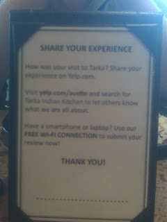 As my camera phone lacks the focus of an SLR camera, what you are looking at is a table tent that is found on each table. On one side is the wine list, and on the side we’re looking at is an invitation to “Share Your Experience” by reviewing them on Yelp. The final paragraph invites customers to submit their review immediately using Tarka’s free Wi-Fi connection.
With this open-ended approach Tarka is accomplishing several things:
A tool we use to gain a topical level of understanding when looking at focus group data and other unstructured text is wordle.net. With it we create word clouds where more frequently used words are displayed in larger font sizes and less frequently used words are displayed in smaller font sizes. We have used this successfully to showcase brand attributes, political campaigns and many other areas. This can help identify broad perceptions and opinions people may have. Below is the resulting word cloud when we feed Tarka’s Yelp reviews through it (note this is just a quick rundown – it has not been cleaned or edited of “nonsense” words such as conjunctions).

Interesting case in point – I was eating dinner at Tarka Indian Kitchen last night, and I saw that they had a well placed call to action to facilitate feedback from customers.
 As my camera phone lacks the focus of an SLR camera, what you are looking at is a table tent that is found on each table. On one side is the wine list, and on the side we’re looking at is an invitation to “Share Your Experience” by reviewing them on Yelp. The final paragraph invites customers to submit their review immediately using Tarka’s free Wi-Fi connection.
With this open-ended approach Tarka is accomplishing several things:
- Driving user-generated content about their restaurant by encouraging reviews
- Gathering unstructured feedback from customers
- Advertising that they have free Wi-Fi
- Gathering point-of-purchase feedback from those that login at their table using their smartphone or laptop
A tool we use to gain a topical level of understanding when looking at focus group data and other unstructured text is wordle.net. With it we create word clouds where more frequently used words are displayed in larger font sizes and less frequently used words are displayed in smaller font sizes. We have used this successfully to showcase brand attributes, political campaigns and many other areas. This can help identify broad perceptions and opinions people may have. Below is the resulting word cloud when we feed Tarka’s Yelp reviews through it (note this is just a quick rundown – it has not been cleaned or edited of “nonsense” words such as conjunctions).

Wednesday, May 26, 2010
The Future Of Brand Research?
This is a quick post, since I missed mine last week! However, the subject is not a small one - brand research. As many of you know Sentient Services believes that the closer research can mimic actual brand interaction environments the better that research is. What do I mean here? Well, if most of a customer's brand experience is with a brand online, then it makes sense to conduct the research online (e.g., an online bulletin board focus group instead of an in-person focus group). Why?
They won't replace focus groups, back-room M&Ms and the nuances that only having a skilled moderator and 8 consumers in a room can bring (think collages, innovation sessions, white boarding website tasks and all sorts of other stuff that keeps us in business!). However, as researchers we have our eye on these new brand engagement platforms that live beyond the typical measured and researched "customer experience" CE scorecards. The customer experience is now everywhere, and discussed everywhere. Research needs to be the same. What are your thoughts?
- If a customer is telling others about a brand only online, then you want to hear and measure their within "native brand language"
- We love focus groups and love traveling and they are great for a myriad of subjects. However, if normal brand interaction is not part of a group, then it makes sense to measure brand interaction on an individual level and not within a group setting.
- If others are receiving peer-group brand feedback online and via social media, the research needs to use the same format. By researching within the format that future communications will take place one can get a better grasp of vernacular, content, and motives to use when making brand research recommendations for implementation.
They won't replace focus groups, back-room M&Ms and the nuances that only having a skilled moderator and 8 consumers in a room can bring (think collages, innovation sessions, white boarding website tasks and all sorts of other stuff that keeps us in business!). However, as researchers we have our eye on these new brand engagement platforms that live beyond the typical measured and researched "customer experience" CE scorecards. The customer experience is now everywhere, and discussed everywhere. Research needs to be the same. What are your thoughts?
Monday, May 10, 2010
A New Way of Asking the Same Question
In the day and age where online surveys have become quite common, there is always a need to keep respondents engaged in the survey process. As you can see in this recent Quirk’s article “How Web 2.0 Made a Long Survey More Palatable,” by Amy Hebard from earthsense, the need to balance getting the information you need and keeping respondents from feeling fatigued is a very big challenge. In this article Amy speaks about how they utilized the latest Web 2.0 techniques in order make sure the respondent enjoys their survey taking experience.
In our own search to keep our audience engaged, we have come across several visual survey formats that allow the ability to ask standard types of questions but in an innovative and captivating way. Take for example Vision Critical’s survey tool within their Sparq online community platform. You can see a full range of abilities they offer in their Respondent Experience product demo, but some interesting capabilities it offers include:
- Ranking by just dragging text or images on the screen into buckets
- Visual marking up of images or pictures and then commenting on the highlighted area
- Other visual type questions such as ordering images to rank and sliders for allocating points or money
Another interesting survey I recently came across is by Ionz. When you go to their site (you must click on the British flag in the right corner for English), an extremely engaging survey pops up. Below are a few screenshots of some questions. You can check out their website to see the full survey.
Instead of the normal radio button question for gender, Ionz used figures of a man and woman that move as you mouse over them.

Another interesting concept they used is displaying other respondent’s answers after you have selected your answer to the question.

Have you come across any interesting examples of using Web 2.0 features to make the survey experience even better? I would love to see them!!!!
Subscribe to:
Posts (Atom)